

Menswear Color Trends 2026: The Architecture of a Bright Revival

The quiet luxury hangover is finally lifting. Summer runways across Paris and Milan signaled a decisive visual shift for the menswear color trends in 2026. The endless parade of beige and gray has broken. Menswear is waking up from a prolonged aesthetic slumber.
Pantone crowned a soft gray hue called Cloud Dancer as its 2026 Color of the Year. The fashion industry vehemently disagreed. Buyers and stylists are declaring the end of the color recession. Instead of playing it safe with tan and black, designers are leaning into high-contrast saturation. Men are moving past stark baseline shades and exploring off-kilter earth tones alongside vivid primaries.
The shift feels sudden but entirely deliberate. Designers are demanding a visual reset across the board.
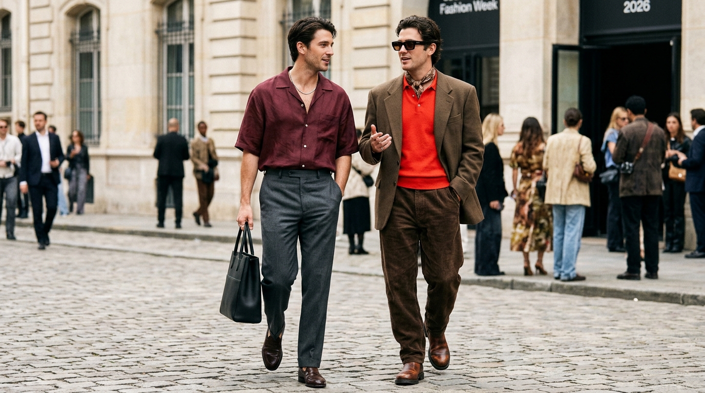
Fabrication plays a massive role in this transition. Auralee is offering airy shirting rendered in deep burgundy. Saint Laurent explores silky jewel tones. Michael Rider at Celine pairs tomato red knits with muddy brown wool trousers.
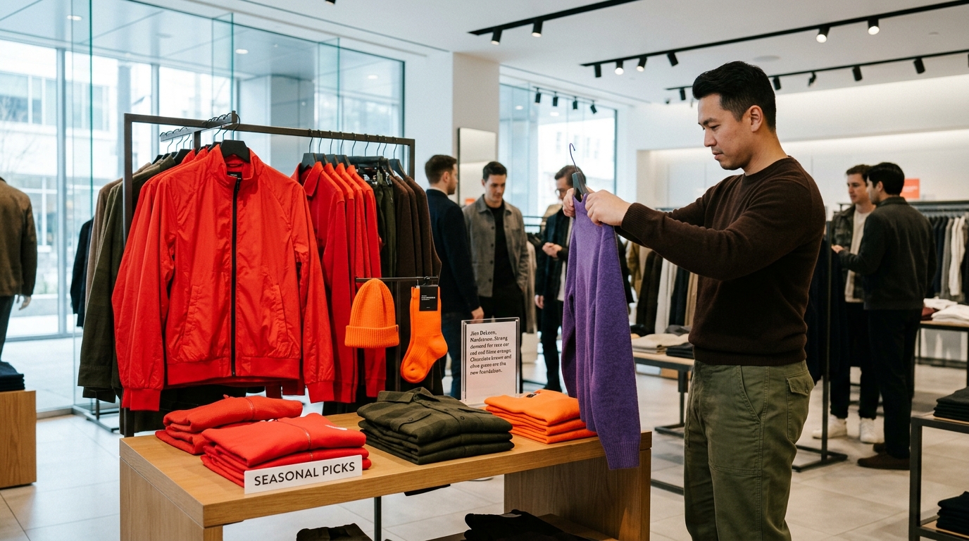
Retailers are adjusting their inventory accordingly. Jian DeLeon at Nordstrom notes strong demand for race car red and blaze orange. The modern consumer is ready.
We must look at how these colors actually function in a wardrobe. Chocolate brown and olive green are the new foundation. They serve as modern neutrals. A pair of deep brown trousers offers a richer base for a purple sweater than a standard gray flannel ever could. Ramon Luna at FWRD points out that men are redefining their personal palettes. Baker pants are replacing beige chinos.
This is an exercise in sophisticated integration, not sheer chaos.
Primary colors are dominating the current market. Red is having a massive resurgence. Four years after Timothée Chalamet wore that ruby Haider Ackermann jumpsuit, the mainstream has caught up. Men are choosing bright red jackets over safe navy options.
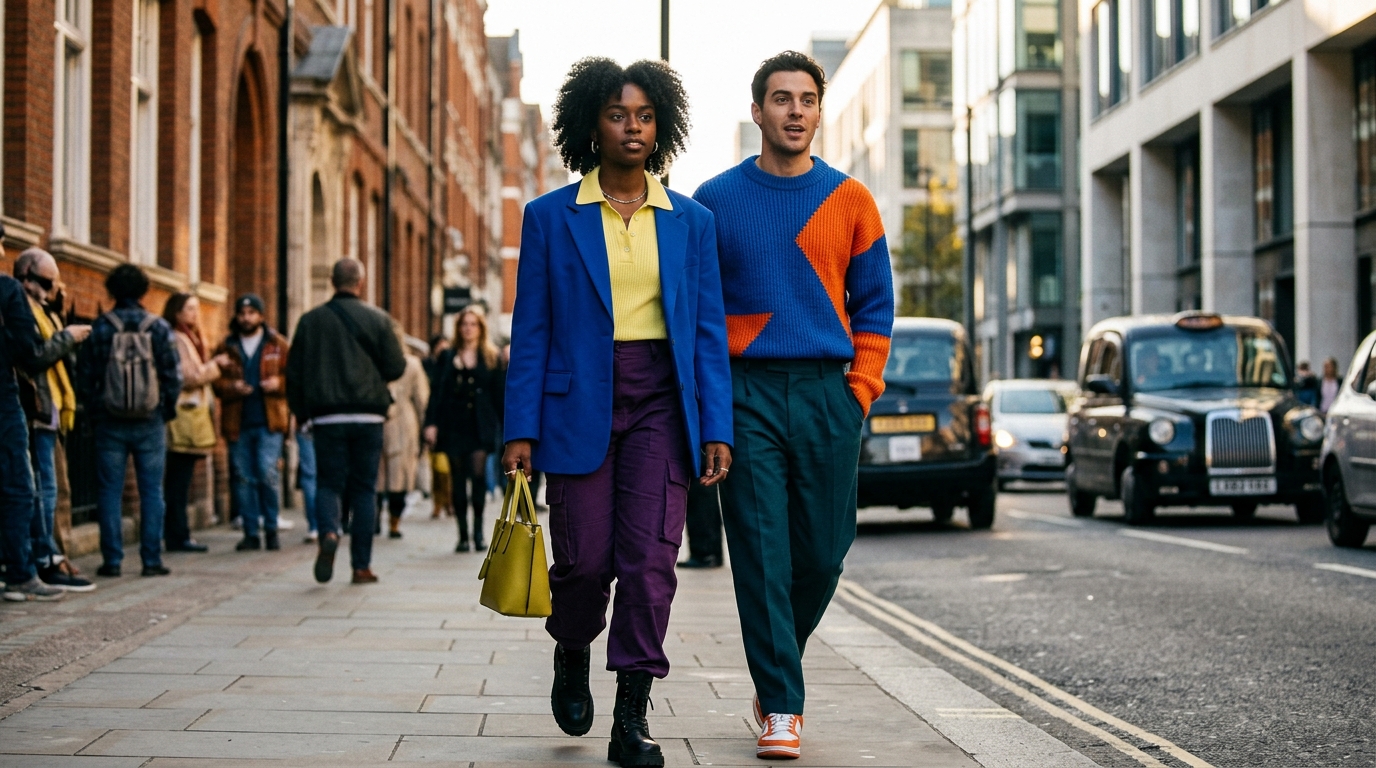
Blue and yellow follow closely behind. The runways presented striking combinations. Willy Chavarria and Ralph Lauren showcased heavy doses of royal blue mixed with orange or lemon yellow. These pairings borrow heavily from comic book aesthetics. Matthieu Blazy leaned into this superhero styling for his knitwear. The goal is to balance these bright tones with grounded textures.
Tertiary shades require a bit more daring. Chartreuse, teal, and deep purple refuse to blend quietly into the background.
Brands like Prada and Versace are pushing these polarizing hues to the forefront. The energy feels reminiscent of the vibrant eighties but anchored by modern tailoring. Color theory becomes essential here. A greenish yellow piece styled with purple works because they are complementary opposites. The eye is naturally drawn to the contrast. It builds a complete aesthetic experience rather than a singular focal point.
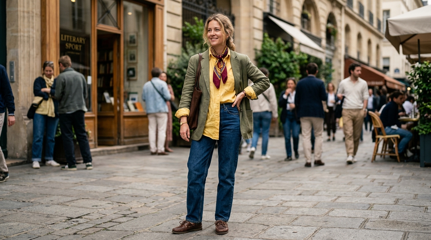
Butter yellow is emerging as the easiest entry point. This creamy shade elevates relaxed tailoring and linen shirts. It pairs flawlessly with chocolate brown or classic denim. It provides warmth without overwhelming the eye.
You do not need to replace your entire wardrobe to participate in this movement.
Start by isolating one unexpected element. A colorful vintage button-down or a bright silk scarf adds immediate character. Jackie McKeown of Literary Sport suggests letting color be the accent rather than the foundation. Monochromatic dressing remains an option for the bold. A tonal look in royal blue or burgundy communicates effortless confidence.
This eclectic approach extends directly to the revival of forgotten footwear.
Boat shoes have returned with a completely different attitude. They are no longer confined to yacht clubs. Designers are styling them alongside oversized tailoring and flowing linen trousers. They offer a relaxed alternative to rigid loafers or heavy boots.
Linen has officially graduated from vacation attire to an everyday uniform. Oversized shirts and softly tailored blazers in vibrant greens or deep plums feel effortless. The natural wrinkles of the fabric add texture to highly saturated tones. This combination of relaxed material and intense color creates a tension that elevates the entire look. It proves that luxury does not require stiffness.
Comfort and high visual impact are no longer mutually exclusive.
Tibi founder Amy Smilovic observed a craving for levity across the industry. She noted how men's runway shows reflected a desire for lightness amidst a heavy global climate. Pastels and off-shades are replacing austere black garments. Brands are no longer restricted to being strictly colorful or entirely minimalist. The boundaries have vanished entirely.
Accessories are mirroring this eclectic shift. Compact digital cameras and tiny oval sunglasses are replacing polished perfection. Men are reaching for pieces with inherent nostalgia and subtle flaws.
The era of playing it completely safe has ended. Menswear is demanding personality again. Embrace the saturation and let the clothes speak for themselves.
Frequently Asked Questions
What are the primary colors trending in menswear for 2026?
Red, blue, and yellow are heavily dominating menswear collections. Designers are specifically favoring vibrant shades like race car red, royal blue, and lemon yellow. These primary tones are frequently styled together for high-contrast looks.
How can I wear butter yellow this season?
Butter yellow is incredibly versatile and acts as a soft neutral. Pair a butter yellow linen shirt or knit sweater with chocolate brown trousers, navy blue, or classic denim. It offers a sophisticated warmth without being as demanding as neon shades.
Are neutral colors completely out of style for men?
No. Neutrals are simply shifting away from standard gray and beige. Chocolate brown, olive green, and charcoal are becoming the new foundational colors. These richer neutrals provide a better canvas for pairing with bright, statement pieces.
What is dopamine dressing in men's fashion?
Dopamine dressing refers to choosing clothing colors that boost confidence and energy. It focuses on using bright hues like vivid pink, emerald green, or sunny yellow to express personality. The goal is to wear shades that feel authentic and uplifting to the individual.
How do I style a bright red jacket for everyday wear?
Treat the red jacket as the solitary focal point of your outfit. Layer it over neutral basics like a crisp white t-shirt and dark denim or olive trousers. This grounds the bold color and prevents the overall look from appearing too costume-like.
Which color combinations are most popular for spring 2027 menswear?
Runways heavily featured unexpected pairings based on color theory. Popular combinations include tomato red with plum, pool blue with navy, and greenish yellow with purple. These complementary and tonal matches create visual interest without clashing.
Related
Articles
Readers always have access to latest trends and perspectives.





Comments: